30 December 2013
New Year’s Resolution: No more Comic Sans!
Regular readers know that I love comics, but hate Comic Sans. A lot of academics use it because they want something that looks handwritten, and they don’t have anything else on their computer that fills the bill.
No more excuses. Make a New Year’s resolution to never put Comic Sans on a poster (or a slide) again. You can start that resolution by getting some new fonts specifically made by and for professional comic book letterers. Richard Starkings of ComicCraft is having a sale!
The New Year’s Sale is at ComicBookFonts.com. Fonts are a mere twenty bucks and 14 cents. ($20.14... get it?) There are lots of other resources there that may interest poster makers, too, like this one on reading flow.
And nobody paid me to say that, either!
External links
ComicBookFonts.com
26 December 2013
Link roundup for December 2013
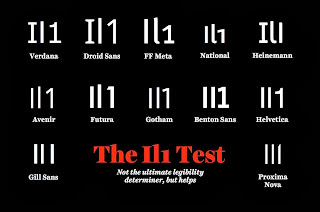
“Fonts have feelings too” is a nice look at typography by Mikael Cho (hat tip to Julie Dirksen). I am indebted for it sharing this visual on text legibility, originally from here:
Namnezia has a nice take on what a poster is for, and why you shouldn’t hold back on presenting stuff on it:
Apparently, many poster authors get their work done here. From I Can Haz Cheezburger.
The difference between screen and print. ICHC again.
ICHC is on a roll.
And I’ve got one more, showing the power of proximity is great. Do not abuse it! Courtesy of Scott Jordan Harris:
The American Society for Cell Biology has a little rationale and tutorial for putting a poster in the cloud. It emphasizes figshare, which has been featured on the blog before.
ACNP spotted this creative and interesting poster tube:
Namnezia has a nice take on what a poster is for, and why you shouldn’t hold back on presenting stuff on it:
(A poster) is not a press release, or pre publication. Rather it is a chance to present your work and get your colleagues excited about it.
Apparently, many poster authors get their work done here. From I Can Haz Cheezburger.
The difference between screen and print. ICHC again.
ICHC is on a roll.
And I’ve got one more, showing the power of proximity is great. Do not abuse it! Courtesy of Scott Jordan Harris:
The American Society for Cell Biology has a little rationale and tutorial for putting a poster in the cloud. It emphasizes figshare, which has been featured on the blog before.
ACNP spotted this creative and interesting poster tube:
19 December 2013
12 December 2013
The one inch rule
One of the most common problems on posters is that things are too close together, which creates the impression of clutter. Let me propose an easy to remember rule for you.
Every element on the poster should have one inch between it and anything else.
The tricky part is to determine what makes up an “element.” For instance, I would treat the following as single “elements.”
Every element on the poster should have one inch between it and anything else.
The tricky part is to determine what makes up an “element.” For instance, I would treat the following as single “elements.”
- The title, author credits, and institutional affiliations.
- A heading and the text below it.
- A figure and its caption or legend.
- A column.
- The title and any logo.
- The authors list or institutional affiliations and the text below it.
- The bottom of one section of text and the next heading.
- Every picture or graph, top and bottom, left and right.
- Separate columns.
05 December 2013
Identifying poster authors: conference organizers, ask for ORCIDs!
I’m lucky. I have an unusual name. The only other Faulkes I know in biology is Chris Faulkes, who does research on mole rats. While I paid the price for having an unusual name in elementary school, I am now reaping a benefit: it’s easy to find my research online.
I feel for K.L. Smith. She told this on Story Collider:
Kelly’s story is a great example of why we need ORCID. For those who don’t have one yet (and you should get one), ORCID is sort of an author’s serial number. Its goal is to distinguish which of the 90,000 papers by K.L. Smith were written by Kelly Weinersmith, formerly Smith, who told the story above.
I am thankful to Mike Taylor, tweeted:
So far, I have yet to see a single conference that asks for my ORCID, even for conferences that intend to publish the abstracts. Conference abstracts are increasing becoming archived rather than being ephemeral, so it would be valuable to start connecting them to specific authors in a systematic way.
P.S.—If you are interested in the forum that Kelly told her story, become a patron of Story Collider!
External links
ORCID
Two nerds fall in love (Name story starts at about 8 minutes in)
I feel for K.L. Smith. She told this on Story Collider:
I had just published my master’s thesis under my maiden name, ‘Smith.’ And I was looking in Web of Science to try to find my publication, but there were over 90,000 papers by K.L. Smith. So I was just lost.
I’m not an old fashioned person, I hadn’t wanted to change my last name, but I have to admit, when I was a kid, I used to dream of having an exotic last name, because I was kind of tired of getting lost in the sea of Smiths.
Things started to go well, and we were talking on OK Cupid, and I remember asking Zach what his last name was, and I was already kind of like falling for him, ‘cause I thought he was great, and he wrote back, and he was like, “My last name is ‘Weiner.’”
And I was like, “This is not what I had in mind.”
But anyway, so then I checked Web of Science to check how many Weiners there were, right? Because if you’re going to take that name, you don’t want to take that hit for nothing. ... But it turns out there’s a lot of Weiners out there. So taking the name Weiner wasn’t really going to help me out that much. It would cut a couple of thousand off, but yeah, I’m not going to take that hit for nothing. But there’s no Weinersmith – all one word. And so, and I thought that was really hilarious, actually, because I’m 12 inside.
And we decided to call ourselves the Weinersmiths for the sake of my career, but I wasn’t going down alone, so I took him down with me. So at that point we became the Weinersmiths.
Kelly’s story is a great example of why we need ORCID. For those who don’t have one yet (and you should get one), ORCID is sort of an author’s serial number. Its goal is to distinguish which of the 90,000 papers by K.L. Smith were written by Kelly Weinersmith, formerly Smith, who told the story above.
I am thankful to Mike Taylor, tweeted:
Academic conference organisers. Nearly 400,000 ORCIDs have been created in a year. Collect them. Use them. Please.
So far, I have yet to see a single conference that asks for my ORCID, even for conferences that intend to publish the abstracts. Conference abstracts are increasing becoming archived rather than being ephemeral, so it would be valuable to start connecting them to specific authors in a systematic way.
P.S.—If you are interested in the forum that Kelly told her story, become a patron of Story Collider!
External links
ORCID
Two nerds fall in love (Name story starts at about 8 minutes in)
Subscribe to:
Posts (Atom)


